
I like this one cuz altho it's girly and has girly elements it doesnt scream "GIRL BLOG!!!!" I want everyone to check out my blog... even if its kinda girly. Now this one on the other hand...

... might not attract everyone... but maybe the right people. I dunno....I love them both SOOO much!!! I dunno which one will go one my MySpace Page but we'll see. Maybe i should figure out exactly who my audience is. What do you think???
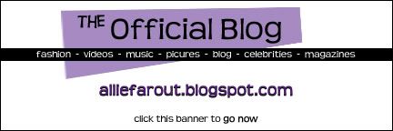
PS. Sorry they're both a little pixelated, the end product wont look like that, I PROMISE!
I think the top one is better because its cleaner and the design is more modern looking. (If you need any free fonts to play with and spice things up, you can always visit Dafont.com! That's where I got my fonts for Gamer Grrlz and my other blogs)
ReplyDeletethanks for the hint. i'll be checking that out TODAY. I love your GamerGrrlz banner, btw.
ReplyDeleteSO welcome! And thank you for the compliment :) I hope you found great stuff at DaFont--EVERY web developer I know prefers it! The fonts are so varied, beautiful, and clean looking!
ReplyDelete